Ironsight Branding
Branding & Stationery
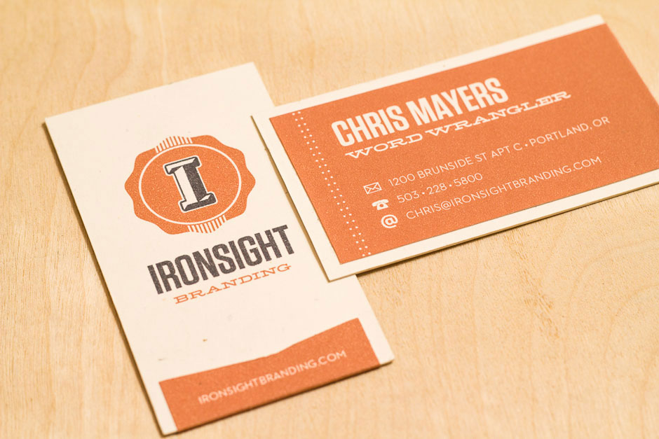
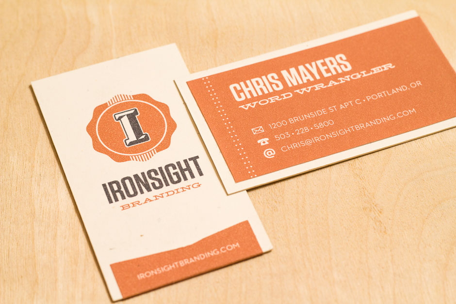
An iron sight is an alignment marker for older firearms. As a branding firm, Ironsight attempts to live up to its name sake: they’ll help you — wait for it — hit your target. The logo reflects a rich history and emulates and old wax seal as well as a strong, prismatic letter that might be found on old, Greek-style architecture.
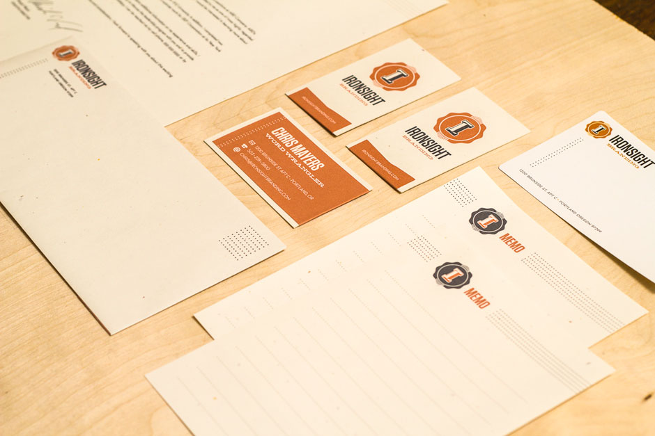
Business Cards
Our business cards have two pieces of paper. One is a natural, smooth card stock while the other is a textured orange that wraps around as a ribbon. We wanted our cards to reflect the multidisciplinary branding agency we had created, so we went with two different textured papers and two different layouts (portrait vs. landscape).
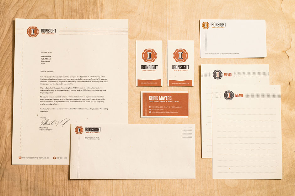
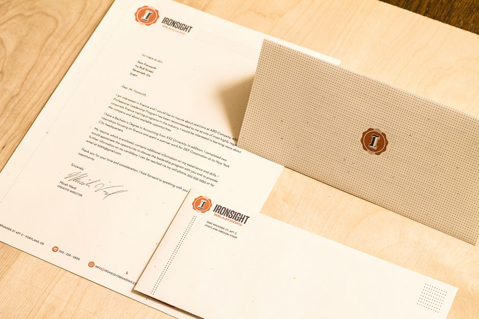
Full Stationery Set
For our stationery, we created the usual letterhead, envelope, and business card, as well as some packing labels, stickers, and memo pads. Each one continues the idea of a multi-faceted agency and explores linear and dotted motifs.